Oceanautica: program website
A redesign of the website of an underwater research program for teenagers — a site I first designed in 2017: a new visual style matched to the personal account, and a structure shaped by a survey of parents and kids.
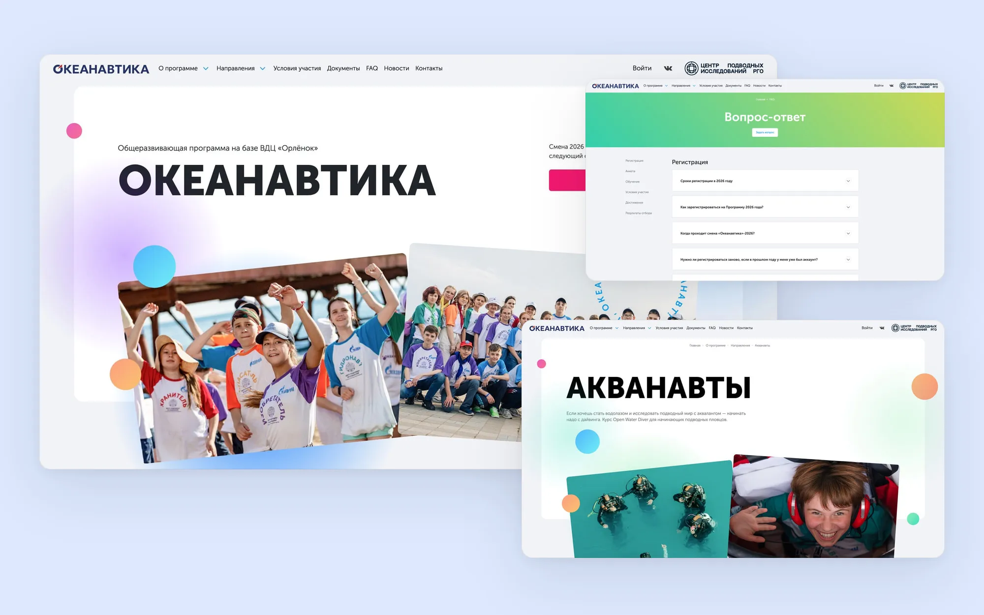
Context
Oceanautica is an educational program run by the Underwater Research Center of the Russian Geographical Society at the Orlyonok children’s center. Teenagers aged 13–16 take a remote online course, and the top 100 are invited, free of charge, to a 21‑day camp session: scuba diving, mini‑submarine dives, building underwater robots, archaeology and water rescue.
Learning and selection happen in a personal account — that is covered in a separate case study. This one is about the public site: what a family sees before signing up, and where they come back for rules, deadlines and news.
I designed the first version of the site in 2017, for the launch of the program. Since then the program has grown and the personal account has been redesigned — next to it, the site had aged in both style and content.
Challenges
- After the personal account was redesigned, the 2017 site no longer matched it: going from the site to registration felt like moving between two different projects.
- The site has two readers. A teenager needs to want it: what will I do at the camp, and which track do I pick? A parent needs to commit without making a mistake: is it really free, which documents, what deadlines?
- By law the parent registers and submits the data, while the child studies and takes the tests — the site has to speak to both without mixing up their tasks.
- The selection is a strict sequence of stages with deadlines, and the program lives in a yearly cycle: a month of registration, learning, the camp and a long off‑season.
Goals
Bring the site into one style with the new personal account.
Learn from parents what they are missing on the site, and close those gaps.
Speak to the parent and the teenager so that each finds their part at once.
Process
-
Kickoff with the program team: clarified which updates were needed and what had changed since 2017
-
A survey of parents — about the site: they are the ones who decide where their child spends the summer
-
A survey of kids — about the personal account, where they study
-
A new visual style for the whole site, matched to the personal account
What the parent survey showed
- 98
- parents out of 126 answered the survey
- 4.65
- out of 5 — how well the site answers questions
- 4.31
- out of 5 — rules and terms: the lowest score
Overall the site was rated convenient and clear, so the job was not to redo everything but to close specific gaps. Almost three quarters of respondents had been in the program before, so I looked at first-timers separately — they are the ones who need the site most.
“We didn’t see it right away, had to look for it”
“A very large amount of information that is hard to read on a computer”
Results
Reviews
Before
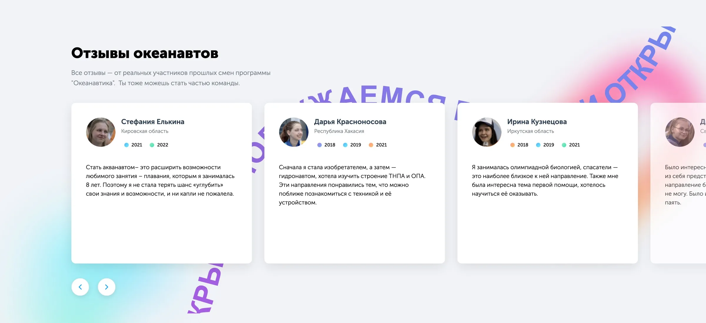
The site had no reviews. Yet 75.5% of parents find them important — 84% among those taking part for the first time.
After
The home page now has a review carousel. Each review is signed with a name and region, and coloured chips show the years of participation — it is plain that many come back three or four times.
Deadlines
Before
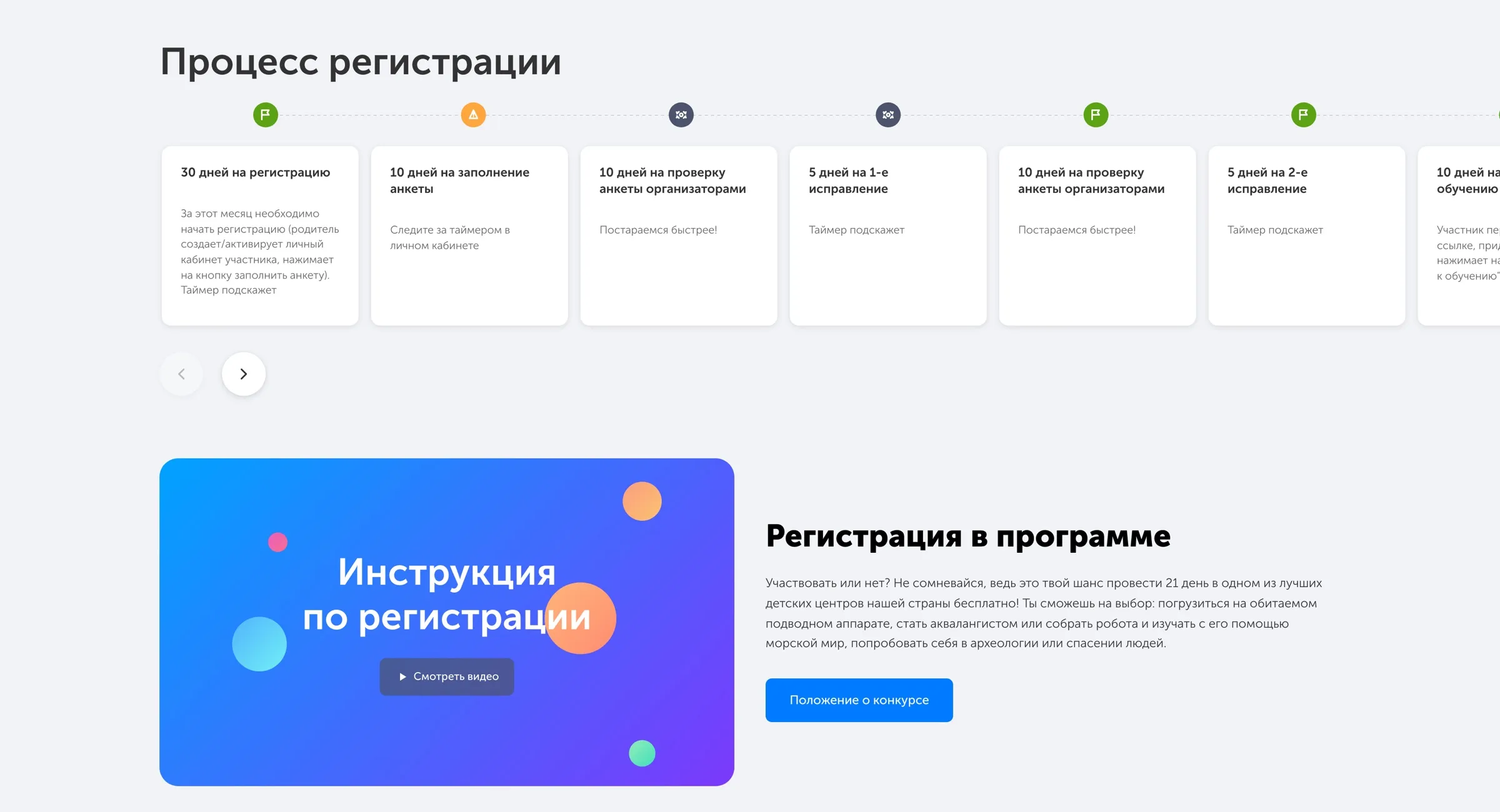
The score for deadlines was high (4.64), but the comments said otherwise: stage deadlines had to be hunted for, and first-timers did not know that even starting the course has one.
After
On the About page registration is shown as a strip of cards: each stage has its deadline in the heading and a single line of explanation below.
Rules and terms
Before
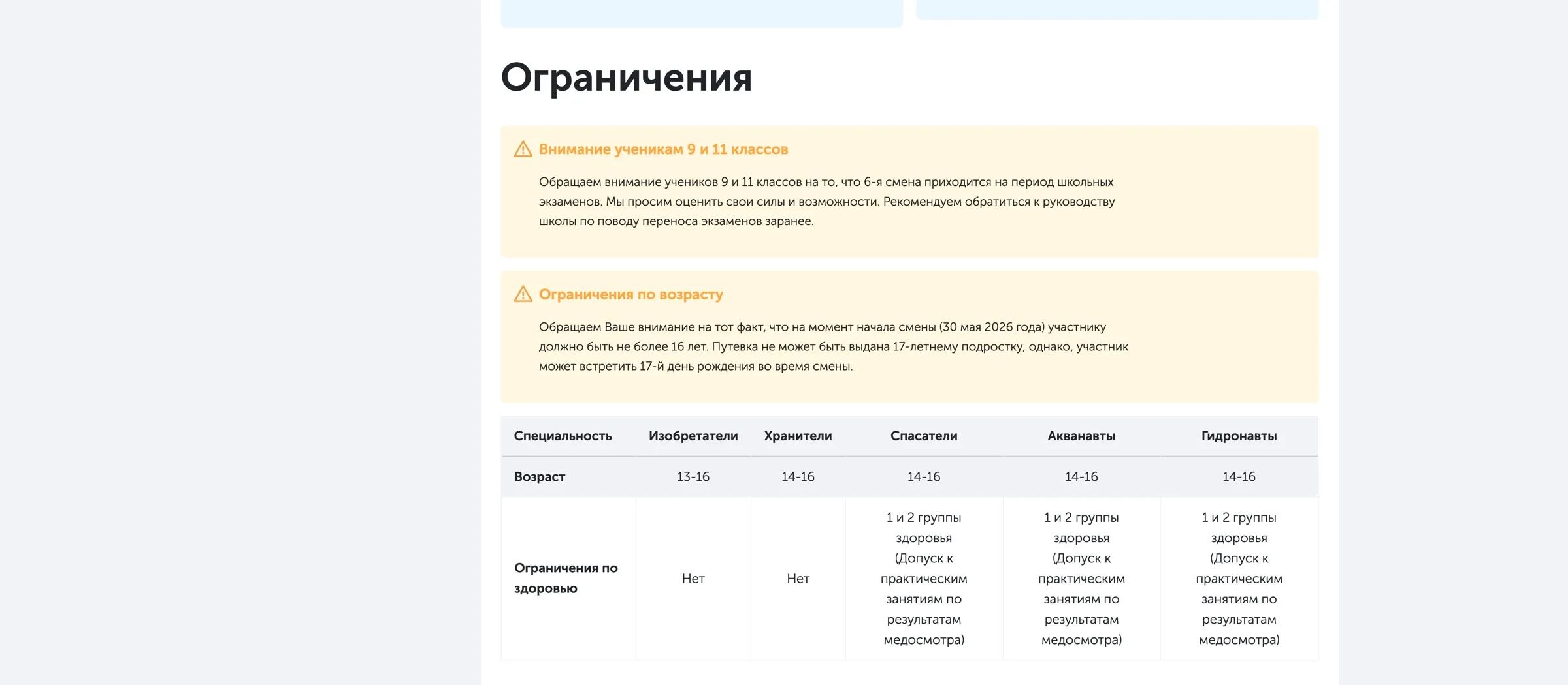
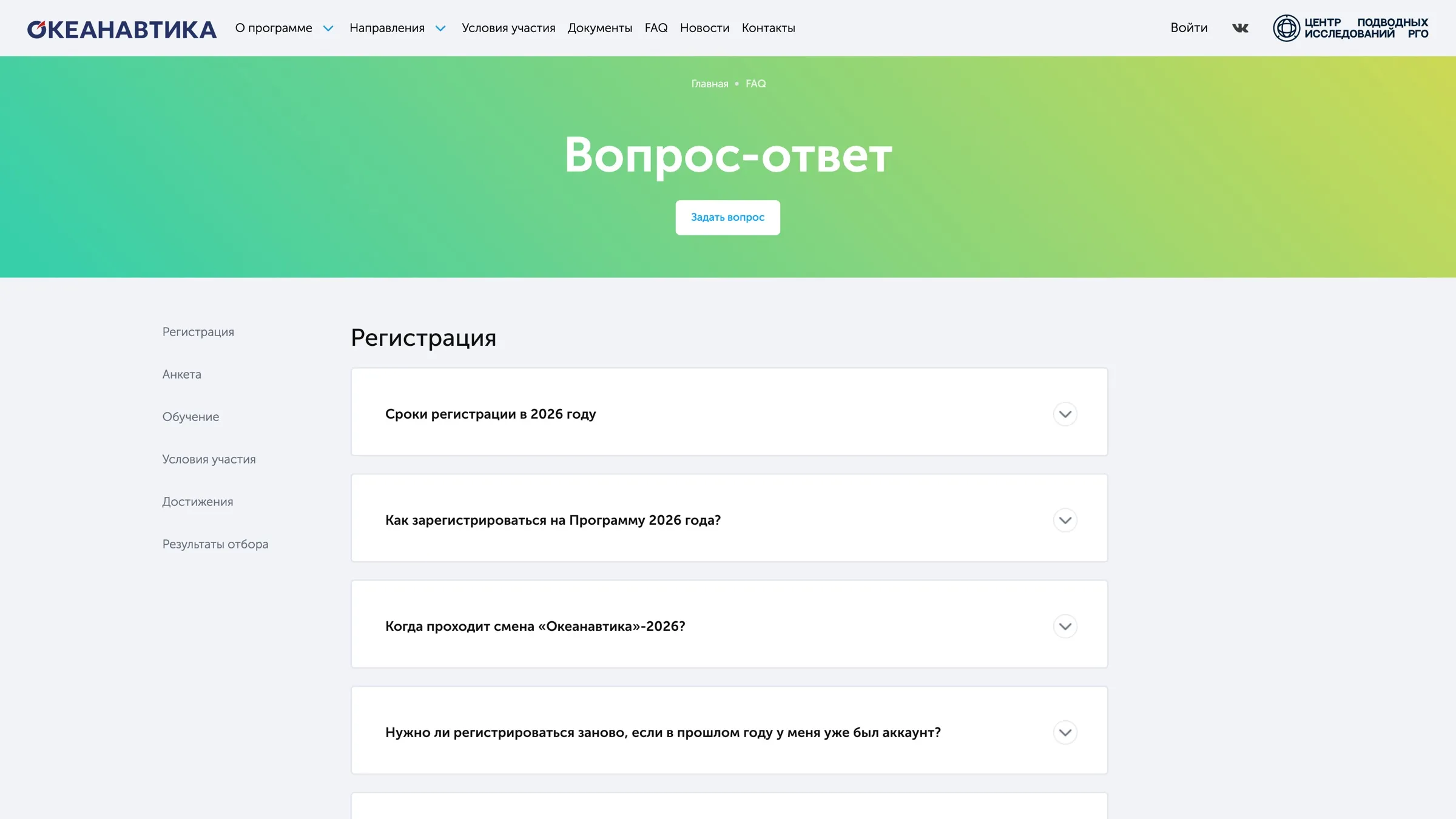
The weakest point of the survey: the rules are a long document that is hard to read on screen, and the achievement scoring was unclear even to an adult.
After
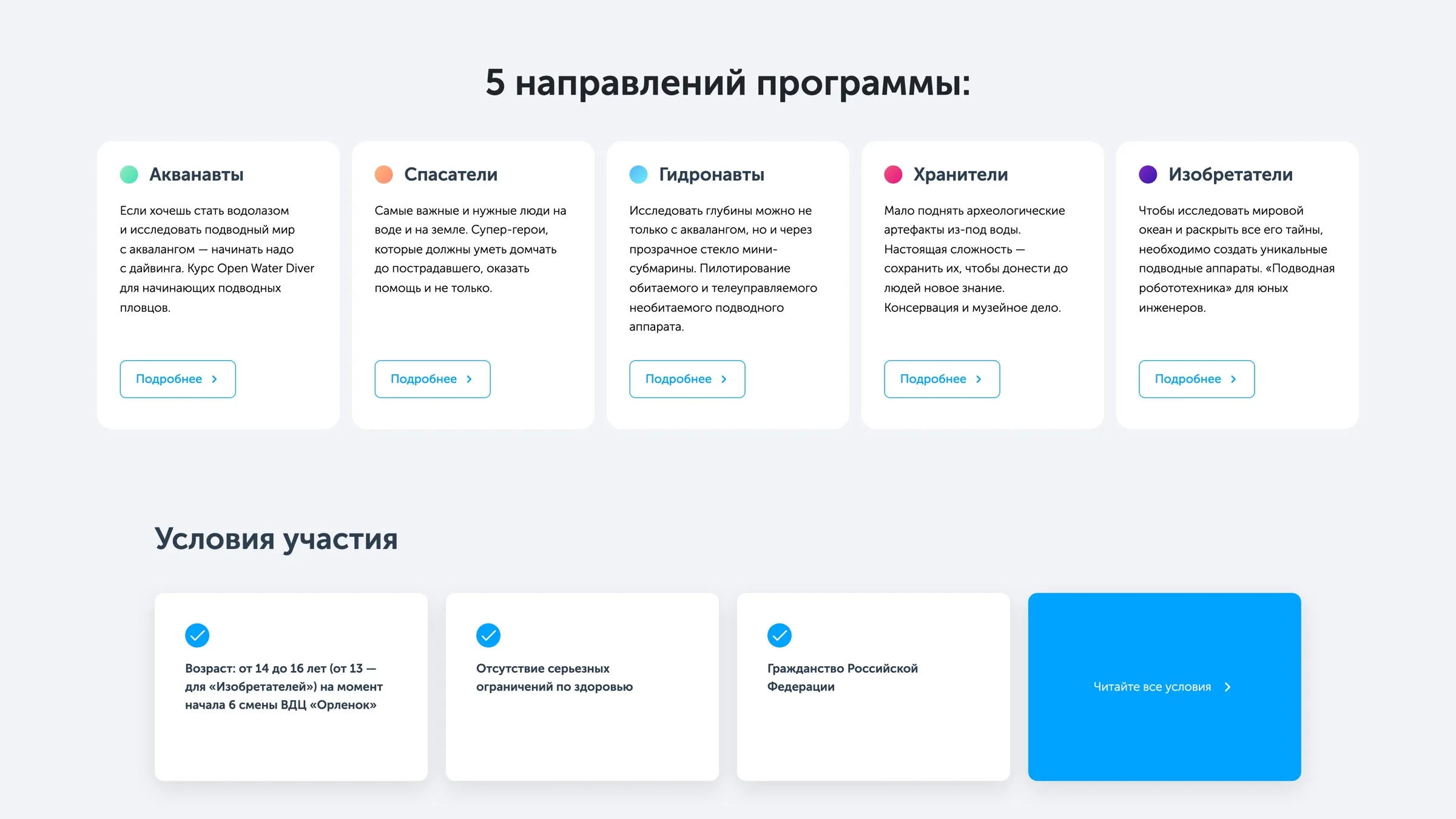
The terms are split into anchored sections, the most common reasons for rejection are lifted into warnings, and the age and health requirements for the five tracks sit in a single table. Achievements have their own section in the FAQ.
The camp and the program
Before
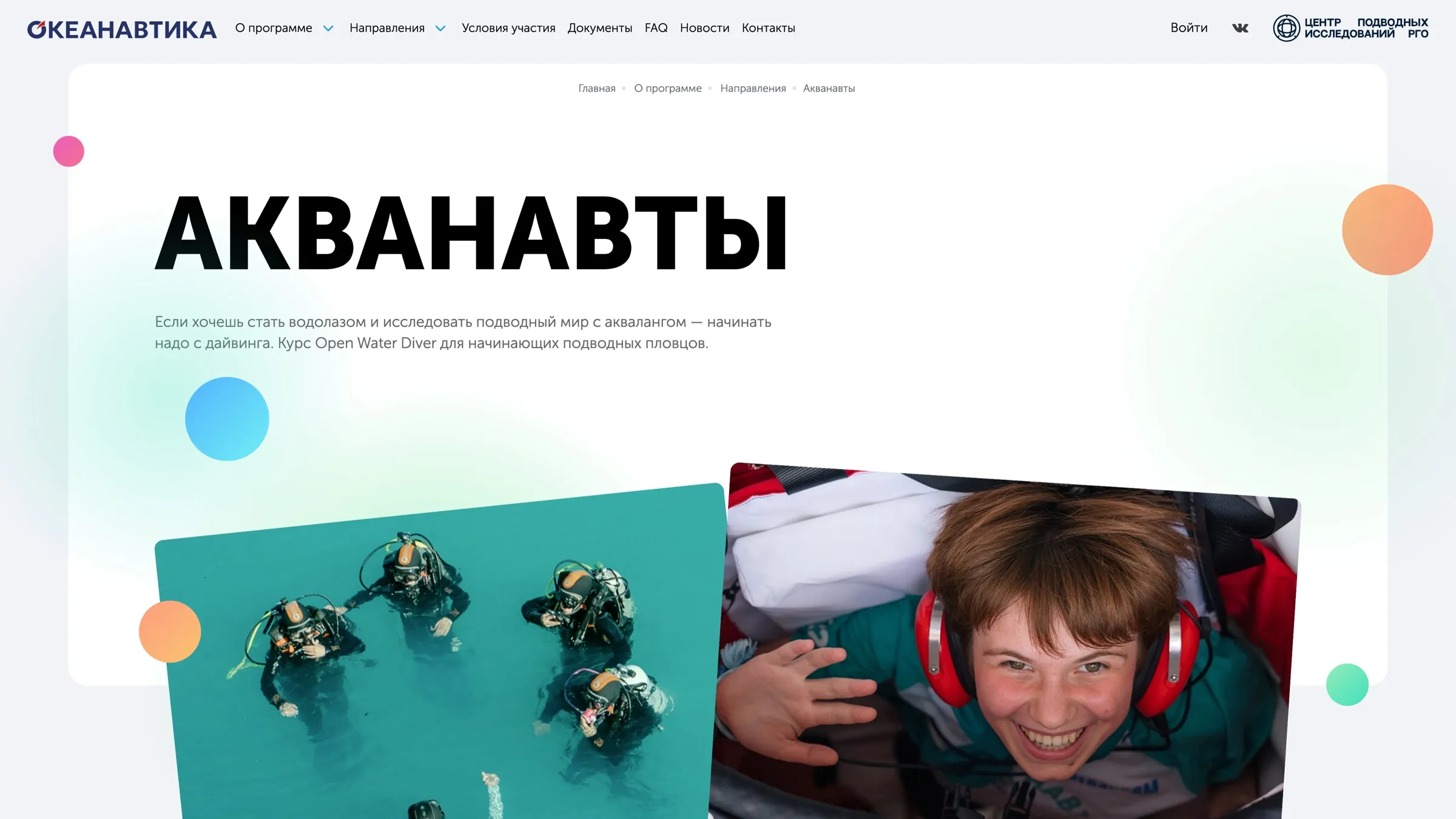
61.2% of parents wanted to know more about the camp — 80% among first-timers. The site described the program but barely showed where exactly the child would be going.
After
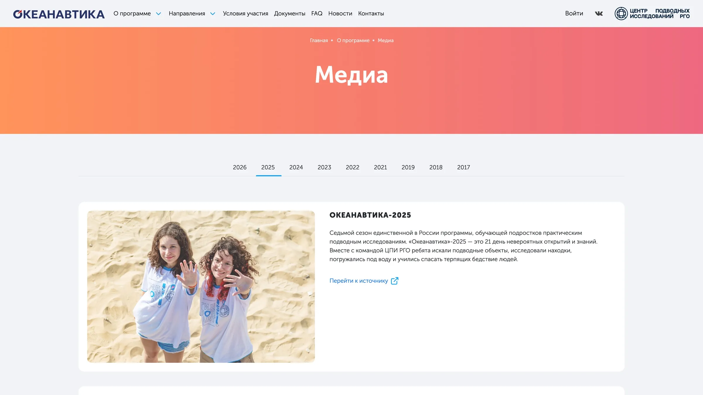
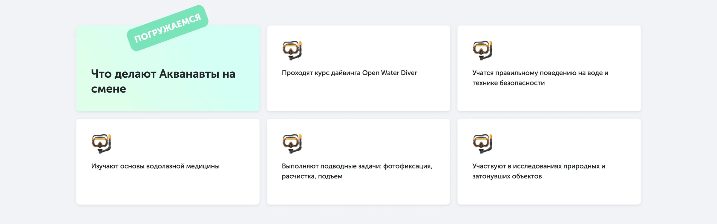
The About menu gained an “About the camp” item, every track has a page with footage from past sessions, and the Media section keeps an archive going back to 2017.
What else changed
One path, two voices
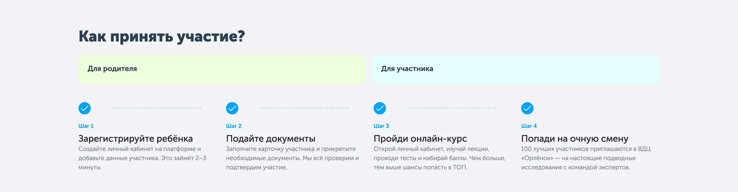
The “How to take part” block splits four steps in half: the first two are “for the parent”, the last two “for the participant”. The tone changes too: the parent is addressed formally, the teenager informally. Each finds their half at a glance.
Five tracks on one screen
Each of the five specialties has its own colour — the same one marks it on the card, on the track page and in the personal account. On the home page all five stand in a single row, so they can be compared without scrolling.
A site that works off‑season
For eleven months of the year registration is closed. During that time the hero says plainly that the session is over and when the next one opens, and the primary action changes from signing up to “Remind me” — a subscription to an email about the start of the new season.
Outcome
The site is live at oceanautica.ru and reads as one product with the personal account: a family goes from their first look at the program to registration without a change of language or style.